Bringing Expressions of Local History and Culture to Airports
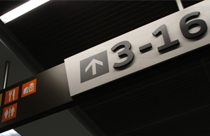
Clear wayfinding in aviation facilities is of utmost importance to aid in passengers’ navigation of these complex environments. There are systems of universal symbols and general a agreement on terminology for airport destinations that aid in travelers’ positive experiences in terminals.
These common symbols and terms point to the idea of highly uniform universal wayfinding signs at all airport terminals. While we believe this is important to certain aspects of an airport’s signs, we also believe totally uniform signage throughout the aviation system is the wrong approach.
Often, landing at an airport is a traverler’s first exposure to a city or even a country. Arrival is an important initial impression, and while understandable and intuitive wayfinding signage is a must, we believe there is a huge opportunity missed if the graphics and architecture neglect to make a design statement about the uniqueness of the local culture and history of the community.
The following are several of our projects where the architecture and sign elements work in concert to set a design tone that is suitable and unique for the terminal’s location.
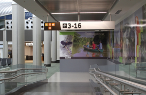
Sacramento International Airport – Terminal B
Architect – Corgan, Fentress
Client – Sacramento County Airport System
Sacramento is known as the “City of Trees”, so it was entirely suitable that their new terminal be designed with the theme of a treehouse. The terminal was designed to bring the outside in through large window areas and a light, airy structure.
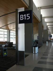
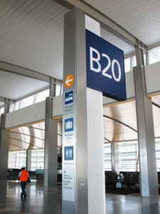
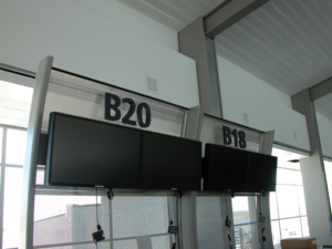
The sign elements reinforced this theme by utilizing translucent materials and simple, strong geometric forms.
As the seat of one of the world’s most progressive governments, accessibility features were added to insure a high level of customer service for passengers with disabilities.
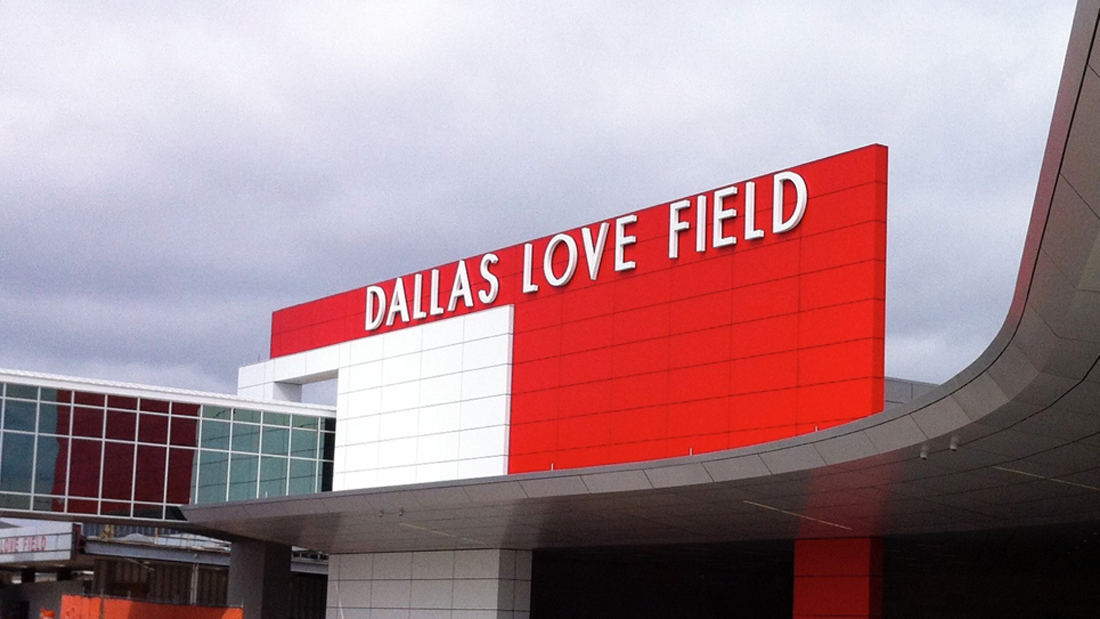
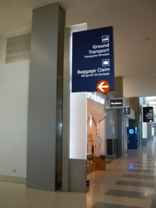
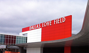
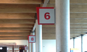
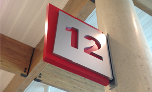
Dallas Love Field
Architect – Corgan
Client – Southwest Airlines, Dallas Department of Aviation
This almost complete makeover of Southwest Airline’s original terminal makes a clear, unique statement both about the airline’s culture and the distinct Dallas boldness and design sensibility.
Bold, modern colors and forms combined with the warmth of the wood beams create a very unique airport environment tailored to the city of Dallas and Southwest Airlines.
The wood beams, rustic steel bracketing, smooth polished concrete columns and dramatic colors and forms of the signs all contribute to this very unique aviation environment.
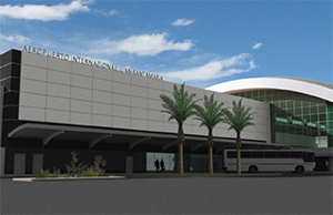
Juan Santamaria International Airport – San Jose, Costa Rica
Architect – RS&H, Rojas Architecture
Client – AERIS
Costa Rica’s primary airport is a focal point for the country’s fast growing eco-tourism economy. Another primary export product is their famous coffee, grown largely on their volcanic mountainsides.
The airport’s management emphasized that the wayfinding program needed to aid in the navigation to and from gates, but also clearly support their concessionaires as they are a vital source of revenue generation.
The sign program implementation was part of a larger construction project that included a new commercial building (above) and the addition of several new gates to the concourse. The lighting and ceilings we redone as part of this project to implement better wayfinding throughout the concourse.
In this project, sign faces were segmented to package primary wayfinding information in one zone, and concession and secondary destination information another zone. Bold, angular forms, subtle patterns and bright colors were used to connect to the architecture and relate to Costa Rican culture.
Jorge Chavez International Airport – Lima, Peru
Architect – RS&H, Cosapi
Client – LAP
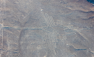
As part of the project team developing a new terminal and roadway system for Lima’s airport, we have the opportunity to connect this with the rich history of Peru. One of the most intriguing and mysterious historic sites is the Nazca Desert in southern Peru, the site of the Nazca lines.
While these ancient geoglyphs are very interesting unto themselves, we thought they could be an interesting reference for wayfinding in the new terminal building.
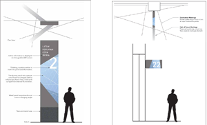
Our concept is that these wayfinding lines could engage not only the sign elements but adjacent ground, wall or ceiling areas to reinforce the verbal information on the signs.
Gate markers may include strips imbedded into the flooring to denote the customers reaching their ultimate destination at the terminal.
With these four examples, we believe that the architecture and signage work together strongly to both reinforce intuitive wayfinding, and make bold visual statements about their location’s uniqueness. For these communities this can be an important initial part of a highly positive experience for travelers’ first time in a new place and be an important part of promoting both tourism and business for the community.